
Why You Should Create Grids With PostCSS-Ant ?
This article will show you how to use PostCSS function to help you create the grid system you’ve always wanted. Flexbox is a great tool for reducing CSS bloat, and has some sugar built in to deal with things like source order and alignment. But it doesn’t offer any help for doing the maths that creates column and gutter sizes. As many experts repeatedly state: Flexbox is nice, but it’s not a grid system.

We should use Flexbox, but we shouldn’t throw away the basic concepts behind grid systems that pulled us out of the ‘GeoCities era’ of design:
- Make columns proportional to something
- Use consistent gutters throughout your design
We can use one of the many Flexbox grid systems out there, but in all honesty, the styles behind these are mostly the same as float-based grids. Authors just add display: flex to the container, along with some helper classes that obfuscate Flexbox properties (for example, a class like .grid-vertical-align-mid is an obfuscation of align-items: center ).
The only difference is, now columns are ‘flexed’ , which means we get that sugar I mentioned earlier. But this still doesn’t solve the main problems that grids face today: grid systems still output a ton of CSS bloat, and grids are still boring.
What is the problem with Grids ?
Grid authors typically distribute huge packs of CSS that can offset, source order, align and resize according to some arbitrary device size. They rely on gzip to mitigate some of the damage, but this doesn’t get it all. What if you don’t need those extra features?
Assuming the framework you’re currently using offers grid mixins, the best solution might be to learn those and compose your own columns. This produces little bloat, but limits your grids to fractions and doesn’t offer you a lot of mobility between different frameworks.
On to the second issue. Designers have become mentally locked in to making all their decisions based on a certain combination of equally sized columns. As a result, the entire internet is beginning to blur together into a ‘stack on mobile; 1/12 column combinations on anything else’ dystopia.
Flexbox introduced flex-grow , which freed us a little. Now we can set sizes that look good and fill in the remaining space with a stretched element, but do gutters line up consistently throughout the page? Are content areas laid out with any sort of proportions in mind, or are we back to just winging it?
Let’s get started to code
The solution to both these problems is wrapped up in a function called postcss-ant. PostCSS plugins can be used with a range of build tools like webpack, gulp or simply the command line. ant mixes seamlessly into plain CSS (or any preprocessor) with a deceptively simple API that masks dozens of mind-boggling calc formulas. It requires two mixin-like parameters to fetch a plethora of grid-friendly sizes.
An example might make this clearer: width: sizes(1/2) get(1) returns calc(99.99% * 1/2 – (30px – 30px * 1/2)) . Let’s break this down:
- sizes() is a space-separated list of sizes. These can be any combination of a variety of sizes: fixed numbers in the form of valid CSS lengths ( px , em , % ); fractions or float numbers (which return whatever is leftover, sans fixed numbers); and auto keywords (which return whatever size is left over, sans fractions and fixed numbers)
- pluck() is a 1-based index that fetches a gridfriendly size from your list. So sizes(1px 2px 3px) get(2) would return 2px
- The calc formula is a grid-friendly size
We get the width for each column in a two-column grid with a single 30px gutter between them:
|
1
2
3
4
5
6
7
8
9
10
11
|
.grid {
display: flex;
flex-wrap: wrap;
}
.half {
width: sizes(1/2) get(1); /* returns calc(99.99% * 1/2 - (30px - 30px * 1/2)) */
margin-right: 30px; /* puts a gutter on the right side of each column */
}
.half:nth-child(2n + 2) { /* starts at the 2nd element and begins counting by 2s */
margin-right: 0; /* removes the last gutter from every row */
}
|
This already gives designers the power to use these sizes wherever they see fit, but let’s dive deeper.
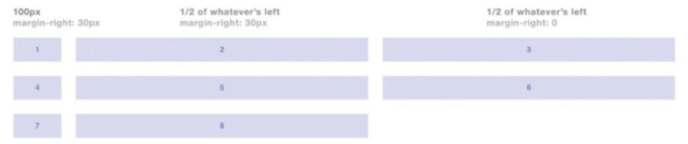
sizes(100px 1/2) get(1) returns 100px . Simple enough, but why would we need to use ant to return 100px ? We’ll get to that in a second.
sizes(100px 1/2) get(2) returns calc((99.99% – (100px + (30px * 1))) * 1/2 – (30px – 30px * 1/2)) . Holy crap. ant is finding out the total size of fixed numbers, and then returning 1/2 of whatever is left over – in an nth grid-friendly way.
We can use these calc formulas to create a grid with a 100px column and two 1/2 columns like so (I’ll be omitting the .grid styles to save trees, but be sure to include them in your code):
|
1
2
3
4
5
6
7
8
9
10
11
|
.fixed-size {
width: sizes(100px 1/2) get(1); /* returns 100px (I know it seems silly but bear with me for a bit longer) */
margin-right: 30px;
}
.half {
width: sizes(100px 1/2) get(2); /* returns calc((99.99% - (100px + (30px * 1))) * 1/2 - (30px - 30px * 1/2)) */
margin-right: 30px;
}
.half:nth-child(3n + 3) {
margin-right: 0;
}
|
Now we can get some previously unachievable sizes, but it’s not super-flexible yet and can require a lot of writing when dealing with many sizes.
Preprocessor Looping
Preprocessors and PostCSS don’t always get along – especially when custom syntax is involved. Luckily, ant’s API is preprocessor-friendly. We can use a PostCSS-parser like postcss-scss with a PreCSS plugin, but this approach uses a lot of unfinished/ unmaintained PostCSS plugins that poorly mimic Sass’ functionality. I’ve found the best workflow is to:
- Use a fast preprocessor like node-sass to watch in.scss to out.css
- Use PostCSS to watch out.css to final.css
- <link> to final.css in your markup
This gives you the best of preprocessor syntax with all the PostCSS plugins your heart desires.
preprocessor loops ant really begins to show its strength when we combine it with preprocessor loops to create layouts that used to be impossible
Now for the cool stuff. Preprocessors typically have a way to loop a specified number of times while providing an iterator:
|
1
2
3
|
@for $i from 1 through 3 {
content: $i; // returns content: 1; content: 2; content: 3;
}
|
With a little knowledge of preprocessors, you can begin using ant in really interesting ways …
|
1
2
3
4
5
6
7
8
9
10
11
12
13
14
15
|
$sizes: 100px 1/2 1/2;
$gutter: 30px;
$length: length($sizes);
.column {
margin-right: $gutter;
@for $i from 1 through $length {
&:nth-child(#{$length}n + #{$i}) {
width: sizes($sizes) get($i) gutter($gutter);
}
}
&:nth-child(#{$length}n + #{$length}) {
margin-right: 0;
}
}
|
Now our irregularly sized columns wrap to new rows without additional markup. Go ahead and tinker around with this code. Try varying sizes, gutters, and adding new sizes (like 100px auto 100px ).
This is a pretty common pattern with ant, so I’ve wrapped it up into a property that works with vanilla CSS as well:
|
1
2
3
|
.grid {
generate-grid: sizes(100px 1/2 1/2); /* You can pass additional options, but pluck() is no longer needed. */
}
|
Numerous Options
nth grids are great when you know the size and number of elements to be passed, but sometimes you’ll want to create a container and just dump some randomly sized elements in there. In these cases, negative-margin grids are your best bet. Simply pass negative-margin to ant like so:
|
1
2
3
4
5
6
7
|
.grid {
margin: 0 -15px;
}
.column {
width: sizes(1/3) get(1) grid(negative-margin);
margin: 0 15px;
}
|
Why Choose PostCSS-Ant
Grid systems are full of bloat. You could master the preprocessor mixins associated with whatever framework you’re using to mitigate this problem, but these mixins can be complicated, and they still limit your creativity by tying you to a fractional (e.g. .col-1-16 { width: calc(100% * 1/16); } ) grid that forces you to use a particular type of markup throughout your site. Wouldn’t it be nice if grids were easy?
Wouldn’t it be nice if we could create bespoke, lightweight grids with our own locally sourced syntax, along with a range of irregular (and/or regular) sizes and capabilities like offsetting and source ordering, in just a few lines of code?
With postcss-ant, grids stop being a boring, bloated burden. Want columns in 100px 1/7 auto 25/100 15em ? Easy. Want to alter or add a few randomly sized columns in that list somewhere? Easy. The supporting styles aren’t forced on you, so you’re free to pluck out whichever of those sizes you’d like. Or if you’re lazy (like me) you can get some really clean supporting styles with an insanely small amount of code.
Want to use Flexbox? What if your client insists on supporting IE8 instead? Easy, easy. It’s like those commercials where you’re promised something amazing, but in this case, ant lives up to its promises and then some. It’s not until you actually try it that you can fully appreciate how complex and amazing this simple API can be.
Conclusion
These examples were just a tiny glimpse at all the cool things postcss-ant can do. It has a couple more optional parameters and lots of descriptive error handling, but ant’s true power is you.
‘Dumb’ tools that simply return a bit of data are always the best tools, as they put the power back into the developer’s hands. That is what postcssant was designed to do. If you’re intrigued, head to corysimmons.github.io/postcss-ant for some face-melting demos and sweet docs.
You May Want to See :
-
 Build A Progressive Web App Using Service Workers
-
 Extend Your Wordpress Theme With WP Child Themes
-
 8 Ways To Optimise Your Wordpress Site
-
 Forensics Analysis of SQLite Database
-
 CrossOver to support DirectX 11
-
 How to Integrate Payments with Stripe API
-
 Manage Large CSS Projects With ITCSS
-
 Multitasking PHP and MySQL
-
 Creating Simple UDP Server And Client to Transfer Data Using C# / VB.net
-
 Enumerations in Swift Programming
-
 How To Use Objective-C Classess in iOS Swift
-
 NSTimer in Swift
-
 Basic Operators in Python Programming
-
 Creating an Audio Player with Swift
-
Characteristic of Python Lists
-
Simple Way to Connect Swift to PHP Code
-
 What is Tomcat ?
-
 What is CSS and What CSS can do ?
-
 Integrating User Authentication Using PHP
-
 Encoding Decoding Data Using PHP
-
 Android Studio: A Platform for Android Development


 Loading ...