
Manage Large CSS Projects With ITCSS
CSS architecture seems to be somewhat in vogue right now. It’s something you’ve no doubt heard mentioned numerous times over the past year or so, and with good reason: UIs (and the teams that build them) are getting bigger and more complicated than ever before. There are a number of aspects of CSS which make it troublesome. It’s declarative, meaning there is no logic or control flow to tell other developers much about the state or construction of the project. It operates in a global namespace, meaning we get collisions, leaking styles and inadvertent regressions. It utilises inheritance, making everything somewhat interdependent and brittle. Finally, the unavoidable specificity model can cause problems when selectors fight each other for prominence.
These are all problems in and of themselves, but when working at any reasonable scale they either become directly more apparent, or the odds of encountering such problems are statistically much higher. Enter a CSS architecture: a way of planning and structuring your CSS for large and long-running projects.
INTRODUCING ITCSS
The architecture we’ll be looking at today is called ITCSS – ‘Inverted Triangle CSS’. This is a methodology that involves visualising your entire CSS project as a layered, upside-down triangle. This hierarchical shape represents a model that will help you order your CSS in the most effective, least wasteful way. Let’s dig in!
ITCSS is something I have been working on, in one form or another, for around four years now. It is no coincidence that I have also spent the past four years working exclusively on digital products: large, long-running projects with entire teams of engineers working on the same codebase for months on end. It is in this kind of environment (legacy, new features, numerous contributors, high velocity, accrued tech-debt, conflicting stakeholder concerns) that a lot more diligence and structure is required with the code we write. This is why I invented ITCSS; to help developers working on these large projects to better organise, scale and manage their CSS.
What ITCSS aims to do is to provide a level of formality and structure to the way we write our CSS. It isn’t a huge departure from the norm, which means the move over to ITCSS shouldn’t prove too difficult. Furthermore, where most architectures and approaches try to avoid CSS’s pesky aspects, ITCSS embraces and tames them, and makes them work to our advantage. ITCSS defines the shared aspects of a project in a logical and sane manner, whilst also providing a solid level of encapsulation and decoupling that safeguards the non-shared aspects from interfering with one another.
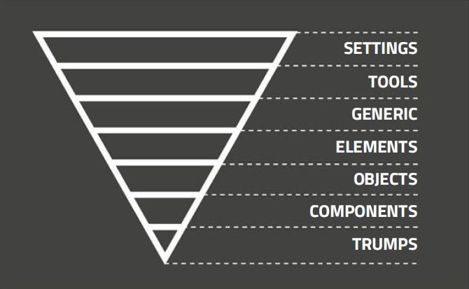
ITCSS involves visualising your CSS project as a layered, upside-down triangle
ITCSS is also incredibly flexible. It is compatible with aspects of other methodologies like SMACSS, OOCSS and even BEM. It can be extended or pared back as necessary, depending on your project. It works with or without a preprocessor, and it doesn’t enforce any specific naming conventions (although I would always recommend you use one). This flexibility means ITCSS can be used on any size or style of project.
PREREQUISITES
Before we dive into the specifics, there are a few prerequisites when working with ITCSS. All of these are becoming standard practice for any modern UI developer. Firstly, no IDs in CSS. IDs are specificity heavyweights, and their use will throw our specificity completely out of joint. Secondly, you need to work to a componentised UI architecture. You no longer build to the ‘pages’ model, but to the widgets/modules/components pattern (ITCSS refers to these as ‘components’). You build discrete, self-contained pieces of UI as reusable components.

Messy style. Unusual or ill-considered source order can lead to an erratic and jumpy application of styles
Finally, ITCSS requires that you are in favour of a class-based architecture. You are not afraid of adding classes to your HTML; you don’t believe that ‘less markup’ and ‘clean markup’ are the same thing; and you understand that binding onto classes, rather than bare HTML elements, provides a more robust and scalable architecture.
KEY METRICS
ITCSS is a fully managed architecture, which means it tells you how to construct your entire CSS project. It doesn’t just tell you how to build your components, for example, but helps you manage everything from Sass architecture to source order, low-level typographical styles to theming, and lots more besides. ITCSS works by ordering your entire CSS project by three key metrics. We’ll look at these now.

Key metrics. The Inverted Triangle’s three key metrics
- Generic to explicit
We start out with the most generic, low-level, catch-all, unremarkable styles, and eventually progress to more explicit and specific rules as we move through the project. We might start with our reset, then progress to slightly more scoped rules like h1–6 {} , right through to extremely explicit rules such as .text-center {} . - Low specificity to high specificity
The lowest-specificity selectors appear towards the beginning, with specificity steadily increasing as we progress through the project. We want to ensure that we avoid as much of the Specificity Wars as we can, so we try and refrain from writing higher-specificity selectors before lower-specificity ones. We’re always adding specificity in the same direction, thus avoiding conflicts. - Far-reaching to localised
Selectors towards the beginning of the project affect a lot of the DOM, with that reach being progressively lessened as we go through the codebase. We want to make ‘passes’ over the DOM by writing rules that affect progressively less and less of it. We might start by wiping the margins and paddings off everything, then we might style every type of element, then narrow that down to every type of element with a certain class applied to it, and so on. It is this gradual narrowing of reach that gives us the triangle shape. Ordering our projects according to these key metrics has several benefits. We can begin to share global and far-reaching styles much more effectively and efficiently, we vastly reduce the likelihood of specificity issues, and we write CSS in a logical and progressive order. This means greater extensibility and less redundancy, which in turn means less waste and much smaller file sizes.
LAYERS
We can stick to these metrics by breaking our CSS up into several sections, or ‘layers’. Each layer must be introduced in a location that honours each of the criteria. Most people (and architectures) attempt to split CSS projects up into thematic groups: here are our typographical styles, here are our form styles, here are our image gallery styles. The downside to this is that it isn’t very sympathetic to how CSS actually works, and doesn’t order CSS in a way that best utilises, tames or takes advantage of the cascade, inheritance or specificity.
In ITCSS, each layer is a logical progression from the last. It increases in specificity, it gets more explicit and intentioned, and it narrows the reach of the selectors used. This means our CSS is inherently easier to scale, as we’re writing it in an order that only ever adds to what was written previously. We don’t waste time undoing or overriding overly opinionated CSS that was written earlier on.
It also means that every thing, and every type of thing, has its own consistent, predictable place to live. This makes both finding and adding styles much simpler, which is particularly useful when you have a number of developers contributing to the codebase. ITCSS, by default, has seven layers. We’ll take a look at each of these in turn now.
- Settings
If you are using a preprocessor, start here. This holds any global settings for your project. I’d like to stress the word global – this layer should only house settings that need to be accessed from anywhere. Settings like $heading-size-1 should be defined in the Headings partial. This ensures this layer stays nice and slim, and means that most settings can be found alongside the code that uses them, making finding things far simpler. Examples of global settings might be things like the base font size, colour palettes, config (for example, $environment: dev; ) and so on. - Tools
The next layer houses your globally available tooling – namely mixins and functions. Any mixin or function that does not need accessing globally should belong in the partial to which it relates. The Tools layer comes after the Settings layer because a mixin may require one of the global settings as a default parameter. Examples of global tools might be gradient mixins, font-sizing mixins and so on. - Generic
The Generic layer is the first one that actually produces any CSS. It houses very high-level, far reaching styles. This layer is seldom modified, and is usually the same across any projects you work on. It contains things like Normalize. css, global box-sizing rules, CSS resets and so on. The Generic layer affects a lot of the DOM, hence it being nice and wide in the Triangle model, and occurring very early on. - Elements
These are bare, unclassed HTML elements. What does an h1 look like without a class on it? What does an a look like without a class on it? The Elements layer binds onto bare HTML element (or ‘type’) selectors only. It is slightly more explicit than the previous layer in that we are now saying ‘make every h1 this big’ , or ‘make every a be a certain colour’. It is still a very low-specificity layer, but affects slightly less of the DOM, and is slightly more opinionated, hence its location in the Triangle. The Elements layer is typically the last one in which we’d find bare, element-based selectors, and is very rarely added to or changed after initial setup. Once we have defined element-level styles, all additions and deviations should be implemented using classes. - Objects
Users of OOCSS will be familiar with the concept of objects. This is the first layer in which we find class-based selectors. These are concerned with styling non-cosmetic design patterns, or ‘objects’. Objects can range from something as simple as a .wrapper element, to layout systems, through to things like the OOCSS poster child – the Media Object. This layer affects less of the DOM than the last layer, has a higher specificity, and is slightly more explicit in that we are now targeting sections of the DOM with classes. - Components
The Components layer is where we begin to style recognisable pieces of UI. We’re still binding onto classes here, so our specificity hasn’t yet increased. However, this layer is more explicit than the last one in that we are now styling explicit, designed pieces of the DOM. We shouldn’t find any selectors with a lower specificity than one class in this layer. This is where the majority of your work will happen after initial project set-up. Adding new components and features usually makes up the vast majority of development. - Trumps
This layer beats – or ‘trumps’ – all other layers, and has the power to override anything at all that has gone before it. It is inelegant and heavyhanded, and contains utility and helper classes, hacks and overrides. A lot of the declarations in this layer will carry !important (e.g. .text-center { text-align: centre !important; } ). This is the highest specificity layer – it includes the most explicit types of rule, with the most narrow focus. This layer forms the point of the Triangle.
So instead of grouping things into ‘typographic styles’ , or ‘form styles’ , we are breaking them into groups based around specificity, reach and explicitness. This format allows us to write our CSS in an order that only ever adds to and inherits from what came previously. We spend very little time undoing things, because our cascade and specificity are all pointing in the same direction. We drastically reduce the amount of collisions, leaks and redefinitions.
PARTIALS
Each layer contains a series of partials. I recommend the naming convention _<layer>. <partial>.scss (for example: _settings.colors.scss , _elements.headings.scss , _components.tabs.scss ). These partials should be kept as small and granular as possible, with each one containing only as much CSS as it needs to fulfil its role. So _elements.headings. scss would contain only the rules h1 to h6 and nothing more. If you have, for example, a Page Title component that makes a main heading (e.g. h1 ) and a subheading (e.g. h2 ) look a certain way, you would create a _components.page-title.scss partial in the Components layer and bind onto classes (e.g. .pagetitle , .page-title-sub ), not onto HTML elements. This is how ITCSS works: we do not place all of our heading-related styles together. Instead, we place all of our element-based rules together, and all of our class-based rules together. We’re now ordering the project based on useful CSS metrics, and not creating awkward specificity and cascade groupings by ordering the project in thematic chunks.

Cone. If we reimagine the Triangle as a cone, we can look down into it to see each layer’s reach
THE RESULT
When this all comes together, it could look something like this:
@import “settings.global”;
@import “settings.colors”;@import “tools.functions”;
@import “tools.mixins”;@import “generic.box-sizing”;
@import “generic.normalize”;@import “elements.headings”;
@import “elements.links”;@import “objects.wrappers”;
@import “objects.grid”;@import “components.site-nav”;
@import “components.buttons”;
@import “components.carousel”;@import “trumps.clearfix”;
@import “trumps.utilities”;
@import “trumps.ie8”;
Even in this tiny example, you can see how each layer can contain any number of partials, and these partials can theoretically sit in any @import order you wish. The only requirement is that the layers themselves always remain in this formation. We ensure each layer contains CSS of:
- A similar specificity: All element-based selectors, or all class-based selectors, or utility classes carrying !important
- A similar explicitness: Styling all your bare HTML elements, or styling UI components, or styling specific helper classes
- A similar reach: Ability to affect all of the DOM (e.g. * {} ), a subset of the DOM (e.g. a {} ), a section of the DOM (e.g. .carousel {} ) or a specific DOM node (e.g. .clearfix {} )
This drill-down approach gives us a much more manageable CSS architecture. Now we know that everything we add should be an addition to whatever has gone before it. We know where each type of rule will live and where to put any new styles, and we have the confidence that all our different selectors will play nicely alongside each other. (Source : NET – June 2015, Author : Harry Roberts)
You May Want to See :
-
 Why You Should Create Grids With PostCSS-Ant ?
-
 Simple Way to Connect Swift to PHP Code
-
 NSTimer in Swift
-
 Creating an Audio Player with Swift
-
 Integrating User Authentication Using PHP
-
 Android Studio: A Platform for Android Development
-
 Build A Progressive Web App Using Service Workers
-
 How to Create iOS Swift “Hello World” Program
-
 Creating Simple TCP/IP Server And Client to Transfer Data Using C# / VB.net
-
 Creating Simple UDP Server And Client to Transfer Data Using C# / VB.net
-
Enumerations in Swift Programming
-
 How To Use Objective-C Classess in iOS Swift
-
 Basic Operators in Python Programming
-
Characteristic of Python Lists
-
 Connect your apps to iTunes Search API
-
 What is Tomcat ?
-
 SSD Reliability Issues
-
 Create Animations in Swift Programming
-
 Multitasking PHP and MySQL
-
 Encoding Decoding Data Using PHP
-
Variables and Types – Python Programming


 Loading ...