
Pebble Time
Pebble Time Review – If there’s one smartwatch we can imagine Apple employees slipping on covertly as they leave the office at night, it’s the Pebble Time. This new watch takes a different approach to the other big names in wearable tech, and we love it.
The Pebble Time is a funky, reliable gadget designed to slip easily into your daily life. Of course, one of the big attractions for potential punters is that you only need to charge the Time once a week (average use), unlike the majority of smartwatches that need to be juiced-up more regularly.

Easy to use, waterproof and sporting extra-long battery life, the Pebble Time is a winner
The big improvement with the Time (compared to the Pebble Watch and Pebble Steel), and one of the main talking points for fans, is the colour screen – we’re looking at 64-shade colour. OK, so it’s not so flash against the Apple Watch’s 262,000 hues, but it’s better than it sounds. Like other aspects of the Time, even when it doesn’t quite have the specs to match the smartwatch big guns, it comes across as simply different, not worse.
Take the colour e-paper screen, for example: it looks rather blocky, its whites are actually a tad grey-ish and its colours are way more muted than any other top smartwatch. However, seeing how the Time’s character is so unique, to us this doesn’t seem like much of a compromise.
The real big win for the Pebble Time is its ‘always-on’ display. Even when the smartwatch runs out of charge, emergency power rations are summoned up to ensure that the screen still displays the time. Speaking of which, there’s no annoying wristflicking action needed to encourage the watch to tell you the time.
Heading outdoors? There’s good news here, too: believe it or not, the e-paper screen actually looks better in dazzling sunlight, so you don’t need to worry about it descending into some kind of reflection-ridden mess.
The Time’s smart LCD tech has a lot in common with what you’ll find in an Amazon Kindle, even though the way it operates under the surface differs. The one downside, however, is that the Time’s screen isn’t natively lit. Instead, it uses a blue-ish front light, like those found on classic Casio digital watches, and it’s very much needed when the lights go out or when you’re in a room with mid-level lighting. As with the Time’s other little ‘quirks’, this light has its charm. Fire up an Apple Watch or an LG G Watch R in the cinema and you’ll soon get nearby audience members groaning – compared to the soft glow of the Pebble Time’s screen, the displays on those two watches are like Mini Maglites.
The Time’s screen style also helps its tiny battery last for days on end. Pebble says you can get seven days’ use from a full charge, but if you’re accessing apps and games on the watch, and receiving regular alerts and notifications too, you’re more likely to be looking at three to four days’ use.
For now, Be careful
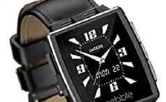
There’s much to love about the Pebble Time, especially its low-key, low-fuss, low-maintenance feel and design. Protecting the screen is a layer of lightly curved Gorilla glass, while around it lies a stainless-steel border. It’s not as impressive as an Apple Watch, but it looks and feels pretty good all the same. You’ll also find a magnetic charging port on the back.
Sadly, it’s in the realms of design where we come across a red flag: the sleek, steel surround’s finish is easy to damage. In fact, if you get through a week without carving a few ultra-fine streaks into it, you’ve done better than us. So yeah, it’s not as resilient as the old Pebble Steel model. However, there’s a Steel version of the Time coming soon. Hopefully, it will fix this issue… and look better than the Apple Watch to boot.
Call the Operator
So far, we’ve painted the Pebble Time as a wearable that’s opted out of key parts of the smartphone game (such as choosing a colour e-paper display over an OLED panel, for example), and that decision to take the less-travelled road with certain elements is also evident in how the watch operates. It doesn’t use a touchscreen or reinvent a classic watch tool like the Apple Watch’s Digital Crown does. Instead, it uses buttons. And they look, feel and operate just like, erm, buttons do. The one on the left side is your ‘back’ button, while the three on the other side of the watch enable you to move up and down through menus and select things. You can get by with these non-nuanced controls because Pebble OS is simpler than Apple’s watchOS or Android Wear.
Whereas watchOS (with watchOS 2 released in June) is perhaps the most confusing piece of software made by Apple since the days before the iPod, Pebble OS is a home screen with a few embedded features, plus a list of the various installed applets.
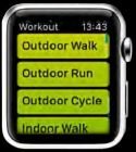
Let’s look at that home screen first. As well as a clock face, of which there are many for you to choose from, you can scroll up and down to look into events that occurred in your past, as well as look ahead to forthcoming events, through a Timeline stream compiling calendar events, missed calls, weather reports and more. It’s a pretty smart way to create a watch UI that feels as though it actually belongs on a timepiece. For the real meaty smartwatch stuff, though, you’ll need to delve into the main menu.
It’s about time
Pebble has taken the colourisation of Pebble OS as an excuse to redesign the appearance of the system. It all feels flashier and fresher, and system apps even have colour-coded icons. If you haven’t got the message so far, Pebble OS is simple, but it can still handle the basics. Despite the low-res screen, you can read notifications – pretty long ones, too. It works best for Android fans (iOS users can also hook up), enabling you to weed out any annoying apps and juggle the more info-rich notifications that you get with Android Wear.
It’s not a one-way thing, either. When you receive a text or WhatsApp message, you can respond straight from the watch by using template messages, emoticons, or by speaking into the all-new microphone. The sound is then sent over to your phone via Bluetooth and translated into text.
Oodles of APPs
The Pebble Time’s reputation as the indie smartwatch darling has helped build a pretty amazing development scene around Pebble OS, and the Time can use any app for the system. Despite being a touch primitive in relation to its hardware, it doesn’t lag far behind other smartwatches in terms of apps.
Those clever coders play to the Time’s strengths – you won’t find many full email clients or any Web browsers, but there’s plenty more to discover here. How about Runkeeper, for example? This app acts as a second screen for your runs, piggybacking off your phone’s GPS to give you accurate wrist readings of your speed and distance. Cyclist favourite Strava works with the Time, too, along with a bunch of other popular trackers. For basic exercise, there are loads of activity trackers, including Misfit, which tracks your sleep and fitness activity, and gives you stats on calories burned, steps taken and hours slept. Other notable apps include Maptastic, TripAdvisor, plus apps that hook into Google Maps Navigation for turn-byturn notifications.
It’s not just apps where the Pebble Time excels. The more you ask it to juggle, the more you realise its buttons are better for getting fast results. But here’s the thing: while the touchscreen of an Apple Watch is better for nimbly dashing through lots of digital content, smartphone software in general is yet to convince us not to take our phone out of our pocket for anything that takes longer than two seconds. You can argue that the Pebble Time’s cards are marked; that its lo-fi strategy means future Apple Watch models and Android Wear wrist-dwelling gadgets will sail past it, making it yesterday’s tech. For now, the combo it offers is on a par with the Apple Watch and the best Android Wear watches. What the Time lacks in obvious tech wizardry, it more than makes up for with sheer ease of use and a refreshing lack of the ‘show factor’ that can make you not want to wear a smartwatch at all.
In essence, if you want a smooth, easy ride into the burgeoning world of smartwatches, you can’t do much better than the Pebble Time.
Pros
- That easy-to-read display
- Solid app support
- Extra-long battery life
Cons
- The hard action buttons can sometimes feel a bit stiff
Pebble Time Specifications
- Price £179
- Url www.getpebble.com
- Resolution 144 x 168
- Screen 1.25-inch, 64-colour LCD
- Storage 16MB
- Platform Pebble OS Connectivity
- Bluetooth 4.0 Le
- Battery 150mAh
- Weight 42.5g
- Water-Resistance 30m
You May Want to See :
-
 Pebble Steel
-
 How to track your run with the Apple Watch
-
 Qualcomm Toq
-
 Apple Watch Alternatives
-
 Casio G-Shock GBA-400
-
 Smartwatches, The Future Smartphone
-
 How Does Apple Pencil Compared to Other iPad Styluses?
-
 How to pair Apple Watch with your iPhone
-
 Double Your Battery Life
-
 Netgear Arlo
-
 Top 3D Printers Desktop Options
-
 10 Tech Invention from Outer Space
-
 Samsung Galaxy S5
-
 Is Hololens For Real?
-
 ASUS FonePad Note 6
-
 Nokia Lumia 530
-
 YotaPhone
-
 Sigma Designs One Lens in Two Versions
-
 Wearables Device, It’s All Started Here
-
 How to Pick a Medical Alert System
-
 Little Big Planet 3


